
You’re drawn to geometric minimalism in branding because it offers clarity, emotional impact, and cultural relevance through simple shapes and bold colors. Its clean lines and basic forms boost memorability and adapt easily across cultures, ensuring your brand feels timeless and trustworthy. This design style communicates messages instantly without clutter, making it highly effective. To discover how these principles craft powerful, lasting brands, you’ll find valuable insights ahead.
Key Takeaways
- Its simplicity ensures instant recognition and memorability across diverse audiences worldwide.
- Bold shapes and colors evoke strong emotional responses, strengthening brand perception.
- Geometric minimalism’s universal language transcends cultural and language barriers effectively.
- Timeless design maintains relevance despite shifting trends, ensuring long-term brand consistency.
- Cultural symbolism within minimal forms fosters authenticity and deeper audience connection.

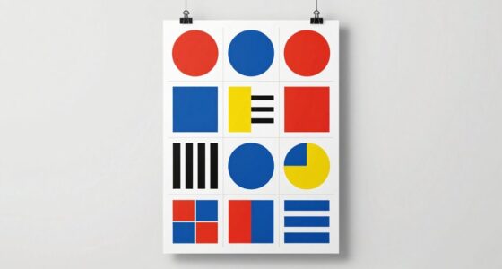
In today’s competitive market, brands are turning to geometric minimalism to create striking, memorable identities. This design approach simplifies visuals, focusing on clean lines, basic shapes, and bold forms that instantly catch the eye. But beyond aesthetics, it’s the strategic use of color psychology and cultural symbolism that really makes geometric minimalism powerful. When you choose specific colors and shapes, you’re not just creating a pretty logo—you’re communicating messages and emotions that resonate deeply with your audience.
Color psychology plays a vital role here. Think about red, which evokes excitement, passion, or urgency, or blue, often associated with trust, calmness, and professionalism. In geometric minimalism, these colors are used intentionally to reinforce brand values and influence perceptions quickly. Since the design is stripped down to essential elements, each color choice becomes more impactful, making your brand more memorable and emotionally engaging. You don’t need complex graphics to convey your message; a simple shape combined with the right color can do the heavy lifting.
Cultural symbolism also shapes how geometric minimalism connects with different audiences. Certain shapes and colors carry specific meanings in various cultures, and understanding these nuances can help you craft a visual identity that feels authentic and respectful. For example, in many Asian cultures, circular shapes symbolize harmony and unity, while in Western contexts, squares might suggest stability and strength. By integrating these cultural symbols subtly into your minimal design, you can forge deeper connections with diverse audiences, making your brand feel more relevant and thoughtful. Recognizing cultural symbolism enhances your ability to tailor your branding to resonate globally. Additionally, understanding cultural nuances can help prevent misinterpretations and foster a more inclusive brand image.
Furthermore, geometric minimalism’s universality makes it adaptable across global markets. Its straightforward shapes transcend language barriers and cultural differences, allowing your brand’s message to be understood at a glance. When you combine this clarity with strategic color use and cultural awareness, your branding becomes both aesthetically pleasing and culturally resonant. It’s no longer just about looking modern or stylish; it’s about creating a visual language that speaks directly to your target market. Additionally, its versatility allows brands to evolve over time without losing their core identity, ensuring longevity in a competitive landscape.
In addition, the enduring appeal of geometric minimalism is partly due to its timeless nature, which allows brands to stay relevant despite changing trends. You don’t have to clutter your logo with unnecessary details to make an impact—just the right shapes, colors, and cultural references. This approach offers a timeless appeal that adapts well to changing trends, ensuring your brand remains relevant and recognizable. When you harness the power of color psychology and cultural symbolism within a minimal geometric framework, you craft a compelling identity that’s both memorable and meaningful.
geometric minimal logo design tools
As an affiliate, we earn on qualifying purchases.
As an affiliate, we earn on qualifying purchases.
Frequently Asked Questions
How Does Geometric Minimalism Influence Consumer Perception?
Geometric minimalism influences your perception by emphasizing visual simplicity, making brands appear modern and trustworthy. You’re likely to associate clean, bold shapes with reliability due to color psychology, which impacts your emotional response. When designs are straightforward and uncluttered, you feel more confident in the brand, perceiving it as professional and innovative. This clarity helps you quickly understand the brand’s message, fostering trust and recognition effortlessly.
Are There Industries Where Geometric Minimalism Is Less Effective?
You’ll find that geometric minimalism isn’t as effective in industries heavily reliant on emotional storytelling, like beauty or luxury brands, where intricate designs evoke feelings better. Its industry relevance diminishes where cultural differences influence color and shape interpretations, making simple geometric forms less impactful. In these sectors, complex visuals often resonate more, highlighting that minimalism’s power isn’t universal but depends on audience perceptions and cultural nuances.
What Are Common Pitfalls When Implementing Geometric Minimalism?
When implementing geometric minimalism, you might struggle with maintaining color harmony and shape consistency. Avoid overcomplicating your design or using too many contrasting colors, which can clutter the minimalist look. Make sure your shapes align and follow a clear visual rhythm to create harmony. Also, don’t forget that consistency in shapes helps reinforce your brand identity, so stick to a cohesive geometric style throughout your branding materials.
How Does Geometric Minimalism Adapt to Digital Versus Print Branding?
Think of geometric minimalism as a universal language, easily adaptable across digital and print. You leverage color theory to evoke emotions on screens, where vibrant hues pop, and in print, where subtle shades convey sophistication. Cultural symbolism guides your choices, ensuring your design resonates deeply regardless of medium. Digital branding demands crisp, scalable shapes for clarity, while print benefits from textured finishes, making your minimalistic message both versatile and powerful across platforms.
What Are Future Trends in Geometric Minimalism for Branding?
You’ll see future trends in geometric minimalism focus on refined color palettes and enhanced visual hierarchy. Expect bold, versatile colors that evoke emotion while maintaining simplicity. Designers will experiment with layered geometric shapes to create depth and guide viewer attention effectively. This approach keeps branding clean yet engaging, making it adaptable across digital and print media. You’ll find these trends help brands stand out while preserving clarity and modern elegance.

Arokimi 1/2" Wood Burning Letter Kit, 26 Pcs Alphabet Branding Iron for Wood Leather Hats BBQ Bread, With an 80W Electric Branding Iron
Wood Burning Alphabet Kit: Brass letters/ numbers, durable and polished smooth, comes with a 80w electric branding iron,…
As an affiliate, we earn on qualifying purchases.
As an affiliate, we earn on qualifying purchases.
Conclusion
Think of geometric minimalism as a lighthouse guiding brands through a foggy sea of clutter. Just like a lighthouse’s simple, bold shape cuts through the mist, clean geometric logos catch the eye and leave a lasting impression. When you embrace this style, you’re not just creating a logo—you’re building a beacon that signals clarity, confidence, and modernity. It’s no wonder that, even today, minimalism continues to shine brightly in branding.
How to Choose Your Perfect Wrist Watch: Identify Watches That Block Your Success, Win Big with Smart Timepiece Secrets, Accelerate Growth, and Apply Numerology to Attract Massive Wealth
As an affiliate, we earn on qualifying purchases.
As an affiliate, we earn on qualifying purchases.
cultural symbolism logo templates
As an affiliate, we earn on qualifying purchases.
As an affiliate, we earn on qualifying purchases.