
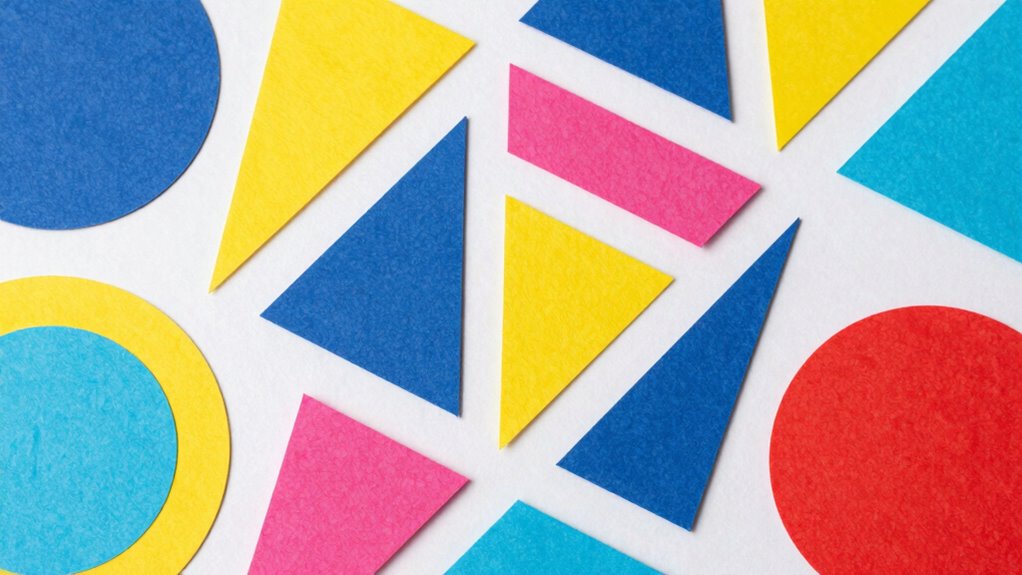
Great infographics use hidden geometric principles to naturally guide your eye and make data easier to understand. They employ grids, symmetry, and proportions like the golden ratio to create visual harmony and balance. Shapes and spatial arrangements are intentionally aligned to help you process information quickly and intuitively. By combining these geometric techniques with color theory, designers craft visuals that are memorable and engaging. Keep exploring, and you’ll uncover how these subtle cues make infographics truly effective.
Key Takeaways
- Hidden geometric patterns, like the rule of thirds and golden ratio, guide element placement for visual harmony.
- Geometric alignment simplifies complex data, improving viewer comprehension and reducing cognitive load.
- Shapes and layout grids create a natural visual hierarchy that directs attention effectively.
- Underlying geometry enhances subconscious engagement through balanced, harmonious design.
- Combining color theory and geometry fosters cohesive visuals that resonate and communicate efficiently.
Have you ever wondered what makes some infographics instantly engaging and easy to understand? The answer lies in a delicate balance of design principles, and at the core of that balance are the concealed geometries guiding your eye. When you look at a well-crafted infographic, you’re witnessing a symphony of shape, space, and color working together to communicate a story efficiently. One key element that often goes unnoticed but plays a major role is color theory. Colors aren’t just about aesthetic appeal; they’re tools that influence how you interpret information. Using complementary colors can create visual harmony, while contrasting hues draw your attention to critical data points. These choices aren’t random—they’re rooted in understanding how the human eye perceives color and contrast, ultimately making data visualization more intuitive. The strategic use of color helps in highlighting patterns, emphasizing differences, and creating an emotional response that motivates further exploration of the content.
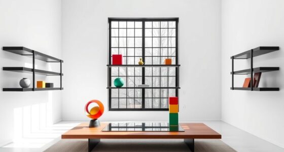
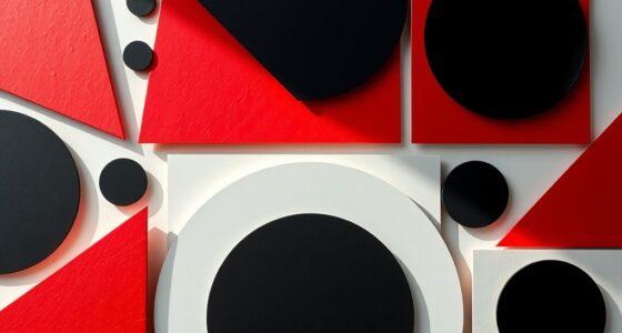
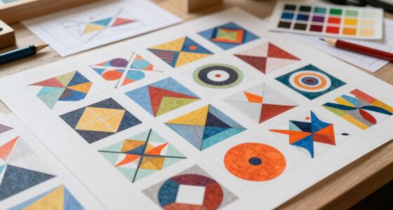
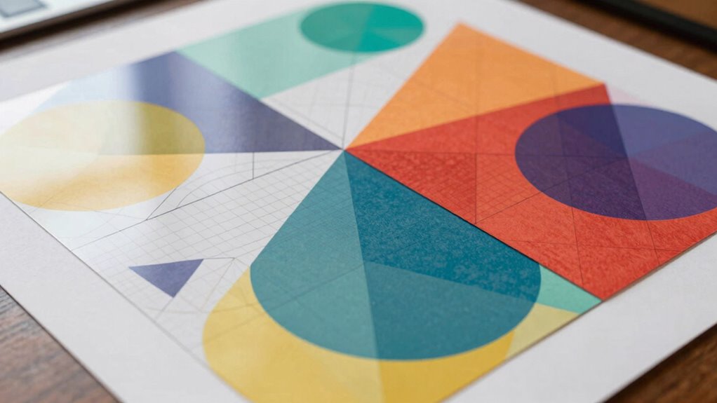
Beyond color, the geometry behind the layout is equally crucial. Great infographics employ a visual hierarchy that guides your gaze naturally from the most important elements to the supporting details. This is where the hidden geometry comes into play—think of grids, symmetry, and proportional spacing that subtly direct your focus without overwhelming you. For example, a well-balanced design will use the rule of thirds or golden ratio to position key data points, making the information feel both natural and pleasing. These geometric principles aren’t just about aesthetics; they serve a functional purpose by making complex data easier to process. When the layout aligns with your innate sense of balance, it reduces cognitive load, allowing you to grasp concepts faster. Recognizing how visual hierarchy influences perception can help creators craft more effective infographics. Understanding the underlying geometric principles enables designers to craft visuals that resonate more deeply with viewers. Additionally, awareness of perceptual cues can enhance how effectively a visual communicates its message by leveraging subconscious processing patterns.
Data visualization itself is a form of geometric storytelling. Charts, graphs, and icons are arranged in patterns that facilitate quick comprehension. The shape of a pie chart, the length of a bar, or the flow of a timeline all follow geometric cues that help your brain decode information rapidly. Every line, curve, and segment is purposefully placed to build a visual narrative that feels seamless and compelling. When these elements are combined with a deep understanding of color theory, they create a cohesive visual language that speaks directly to your subconscious. So, the next time you’re captivated by an infographic, remember it’s not just about the data presented, but about the hidden geometry working behind the scenes to make that data meaningful and memorable.

GAUENEEN 5 Pcs Architectural Templates: Circle, House Plan, Interior Design & Furniture Templates, Drafting Tools & Ruler Shapes for Architecture
- Interior Design Template Set: Includes house, furniture, and interior templates
- Circle Drawing Templates: Various size circle rulers for geometric patterns
- High-Quality Material: Flexible, sturdy plastic for durability and ease of use
As an affiliate, we earn on qualifying purchases.
As an affiliate, we earn on qualifying purchases.
Frequently Asked Questions
How Does Color Theory Influence Infographic Design?
You leverage color theory in infographic design by choosing colors that create color harmony, making your visuals pleasing and easy to interpret. This approach also enhances emotional impact, guiding viewers’ feelings and reactions. By selecting complementary or analogous colors, you draw attention to key data points and evoke specific emotions, like urgency or trust. Effective use of color theory guarantees your infographic communicates clearly and resonates emotionally with your audience.
What Tools Are Best for Creating Geometrically Precise Infographics?
You should use tools like Adobe Illustrator or CorelDRAW for creating geometrically precise infographics. These programs let you perform symmetry analysis and work with grid structures effortlessly, ensuring your design remains balanced and accurate. Additionally, tools like Canva or Figma provide user-friendly interfaces with grid options that help align elements perfectly. By leveraging these tools, you can craft visually compelling infographics rooted in strong geometric principles.
How Do Cultural Differences Affect Visual Perception in Infographics?
Cultural differences greatly influence how you perceive infographics, especially through cultural symbolism and visual hierarchy. You might interpret colors, icons, or symbols differently based on your background, impacting the message’s clarity. To guarantee your infographic appeals broadly, consider universal symbols and a clear visual hierarchy that guides viewers naturally. By doing so, you respect diverse perceptions and communicate your data effectively across cultures.
Can Hidden Geometry Improve Data Retention?
Sure, hidden geometry can improve data retention, but only if you notice its subtle cues. By leveraging visual patterning and spatial reasoning, you’ll find that well-designed infographics guide your eye naturally, making information stick. Ironically, the less you realize you’re noticing the design, the better you remember the data. Mastering these hidden geometries transforms complex info into memorable visuals, proving subtlety often outperforms loud, obvious charts.
What Are Common Mistakes in Applying Geometric Principles?
You often make mistakes by neglecting symmetry and balance, which can make your infographics appear chaotic instead of harmonious. Overusing proportional harmony without considering visual weight can cause clutter, while ignoring these principles might lead to unappealing designs. To avoid errors, make certain your elements are proportionally balanced and symmetrical where needed, creating a cohesive flow. Recognizing these common pitfalls helps you craft visually appealing, effective infographics that engage and inform your audience.

Golden Ruler Designer Brass Wallet Fibonacci Sequence/Series Ratio Multi Tool Essential Metal Card 3.25"x2" (Gold)
- Fibonacci and Golden Ratio Design: Inspired geometric patterns
- Brass Imperial Ruler: Timeless metal construction
- Designer Multi-Tool: Stylish desk accessory
As an affiliate, we earn on qualifying purchases.
As an affiliate, we earn on qualifying purchases.
Conclusion
So, next time you craft an infographic, remember—you’re wielding the power of hidden geometry, shaping minds faster than lightning, mesmerizing eyes with the precision of a master architect. Your design isn’t just visuals; it’s a magnetic force pulling viewers into a vortex of understanding, making complexity vanish like magic. Embrace these unseen patterns, and watch your infographics transform into unstoppable, mind-blowing masterpieces that dominate the universe of information!

Jinwaftv Color Wheel Poster Vintage Color Theory Knowledge Poster Educational Wall Art Infographic Poster Landscape Paintings on Canvas (12.00''x18.00'',Unframed)
- Multiple Size Options: Various sizes including framed and frameless
- Unique Aesthetic Design: Distinctive visuals blending knowledge and style
- Premium Quality Material: Vivid colors and durable imagery
As an affiliate, we earn on qualifying purchases.
As an affiliate, we earn on qualifying purchases.

THE AI ARCHITECT'S COMPLETE REFERENCE MANUAL VOLUME III VISUAL ARTS & DESIGN: Mastering Static Imagery for Print, Web, and Brand
As an affiliate, we earn on qualifying purchases.
As an affiliate, we earn on qualifying purchases.