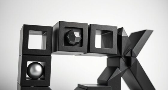

In graphic design, using geometric shapes helps you guide viewer perception, evoke emotions, and build cohesive visuals that enhance your message. Shapes create structure, emphasize important elements, and set the tone through their form and color. Circles promote harmony, while sharp shapes evoke energy or stability depending on their placement and hue. Mastering how to combine shape, color, and typography ensures your designs communicate effectively. Keep exploring to discover how these elements work together for powerful visual storytelling.
Key Takeaways
- Geometric shapes establish structure and focus, guiding viewer attention and enhancing message clarity.
- Shape selection influences emotional tone; rounded shapes evoke harmony, sharp shapes suggest energy or stability.
- Combining shapes with strategic color schemes reinforces design intentions and emotional responses.
- Shapes serve as backgrounds or framing devices to highlight typography and improve message memorability.
- Mastering shape, color, and typography integration creates cohesive visuals that communicate effectively.
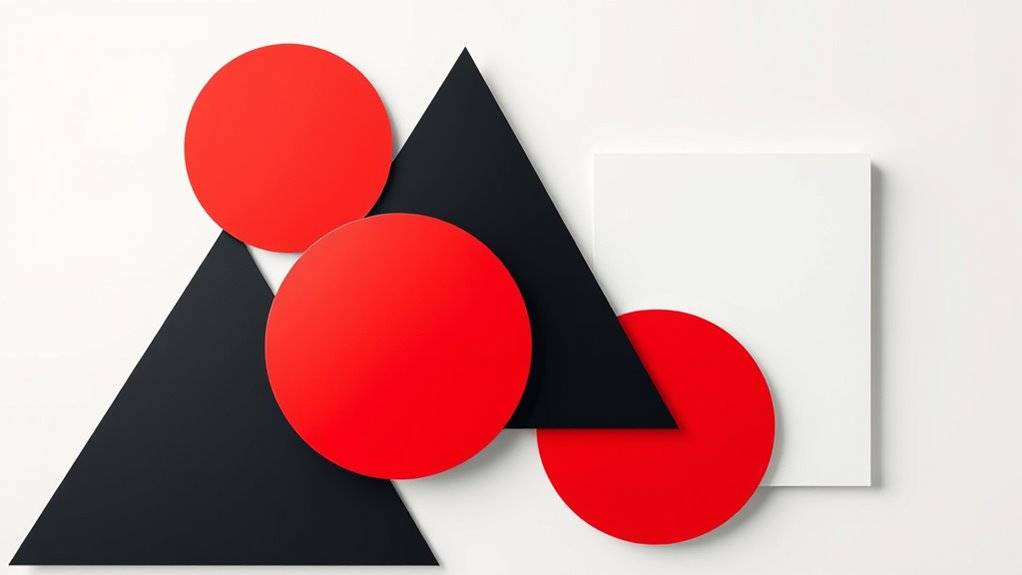
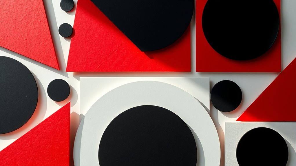
Have you ever wondered how geometric shapes influence the way we perceive visual designs? The answer lies in their ability to create structure, guide focus, and evoke specific emotions. When you understand how to use shapes effectively, you can craft visuals that communicate your message clearly and powerfully. One key aspect to contemplate is color theory, which interacts seamlessly with the geometry of your design. Shapes act as containers that can emphasize particular color schemes, whether you’re aiming for harmony or contrast. For example, circles can soften a design, especially when paired with analogous colors, creating a harmonious and inviting feel. Conversely, sharp-edged triangles or squares can evoke energy or stability, depending on their placement and color choices. Combining shape and color intentionally allows you to influence how viewers interpret your visuals on an emotional level. Additionally, understanding the importance of visual perception can help you create more effective designs by aligning shapes and colors with how viewers naturally process visual information.
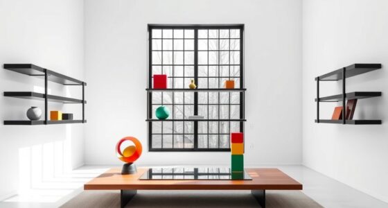
Typography integration is another essential element when working with geometric shapes. The way you incorporate text into your design can make or break its effectiveness. Using geometric shapes as backgrounds or framing devices draws attention to specific words or phrases, making your message more memorable. For instance, placing bold, sans-serif type within a circle can give a modern, clean look that reinforces clarity. Alternatively, aligning text along the edges of a rectangle or within a polygon can create a sense of order and professionalism. When you integrate typography with shapes thoughtfully, you guide the viewer’s eye naturally, ensuring that your message isn’t lost amidst clutter. The shape’s form can also influence the typeface style you choose; rounded shapes often pair well with softer, more approachable fonts, while angular shapes lend themselves to more assertive, contemporary typefaces.
Furthermore, understanding how these elements work together helps you develop a cohesive visual language. The geometry provides the framework, allowing your color choices and typography to communicate specific moods and ideas. You can use symmetry to establish balance or asymmetry to generate dynamism, all while considering how your color palette enhances these effects. When you master the integration of color theory, typography, and geometric shapes, your designs become more than just visually appealing—they become compelling messages that resonate with your audience. It’s about creating a harmony that guides the viewer effortlessly through your visual story. So, the next time you’re designing, think about how your shapes can serve as a foundation for color and typography, making your visuals not only attractive but also meaningful.
Frequently Asked Questions
How Do Geometric Shapes Influence Viewer Emotions?
You influence viewer emotions by choosing geometric shapes, as they evoke specific feelings through shape symbolism and color psychology. Circles create a sense of harmony and unity, while squares convey stability and reliability. Triangles evoke energy and movement. When combined with colors, these shapes enhance emotional impact, guiding viewers’ perceptions and reactions. Your strategic use of geometry can make your visuals more compelling and emotionally resonant, shaping audience responses effectively.
What Are Common Mistakes in Using Geometry for Visuals?
You often make mistakes by misusing proportions, which can lead to unbalanced or confusing visuals. Overcomplicating designs with too many shapes or details can distract viewers and dilute your message. To avoid this, keep your geometry simple and well-proportioned, focusing on clarity and purpose. Remember, less is often more; a clean, balanced design resonates better and communicates your message effectively.
How Can Geometry Improve Brand Recognition?
You can boost brand recognition by using geometry strategically, leveraging color psychology and cultural symbolism. Simple shapes like circles suggest unity and trust, while triangles indicate stability or energy. Consistently applying these shapes and associated colors helps your audience quickly identify your brand. By understanding cultural symbolism, you guarantee your visuals resonate across diverse audiences, making your brand memorable and recognizable through intentional geometric design choices.
Are Certain Shapes Better for Specific Industries?
Your choice of shapes can make or break brand identity—it’s like wielding the power of a thousand suns. Certain shapes work better for specific industries because of industry symbolism and cultural interpretations. For example, circles evoke trust and community, ideal for healthcare, while sharp triangles suggest innovation, perfect for tech brands. Understanding these nuances helps you create visuals that resonate deeply, ensuring your message hits the mark every time.
How Does Scale Affect the Perception of Shapes?
Scale substantially impacts how you perceive shapes, influencing size perception and visual hierarchy. When you enlarge a shape, it draws more attention, signaling importance or priority in your design. Conversely, smaller shapes recede into the background, creating a sense of depth. You can manipulate scale to guide viewers’ focus, establish relationships, and communicate your message effectively, ensuring your visual hierarchy remains clear and engaging.
Conclusion
You now see how geometry transforms your designs into striking visuals. Incorporating simple shapes can increase viewer engagement by up to 80%. By mastering geometric principles, you’ll create more balanced, memorable, and effective graphics that capture attention instantly. So, next time you’re designing, remember that a well-placed shape isn’t just decoration—it’s a powerful tool to communicate your message clearly and convincingly. Embrace geometry and elevate your creative projects to new heights.