
Geometric typography designs letters from simple shapes like circles, squares, and triangles, giving your text a clean, modern look. You manipulate these basic forms through stretching, rotating, and combining them to create visually balanced characters. Paying close attention to symmetry guarantees your letters are harmonious and easy to read. With thoughtful shape adjustments, you can develop a minimalist style that’s both impactful and timeless. Keep exploring to discover more about shaping your own geometric typefaces.
Key Takeaways
- Geometric typography uses basic shapes like circles, squares, and triangles to construct letterforms, emphasizing simplicity and modernity.
- Shape manipulation—such as stretching, rotating, and combining shapes—is essential for developing distinctive, cohesive characters.
- Symmetry in letter design ensures visual harmony, balance, and enhances readability within geometric typefaces.
- Minimalist principles require precise shape adjustments to maintain clarity, visual weight, and stylistic consistency.
- Mastering shape proportions and manipulation techniques helps create impactful, balanced geometric fonts with a sleek aesthetic.
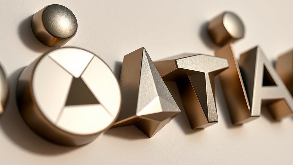
Geometric typography is a design style that uses simple shapes like circles, squares, and triangles to create clean, modern letterforms. This approach relies heavily on the fundamental principles of shape manipulation and letter symmetry to craft visually striking and balanced characters. When working with geometric type, you become aware of how each letter is essentially a composition of basic shapes, carefully arranged to convey clarity and order. By understanding how to manipulate these shapes, you can design letters that are both aesthetically pleasing and highly functional. Additionally, understanding the importance of consistent proportions helps maintain harmony across the entire typeface. Letter symmetry plays a vital role in geometric typography. Symmetry ensures that each letter maintains visual harmony, which enhances readability and creates a sense of stability within the typeface. For example, symmetrical letters like “A,” “H,” or “O” often feature mirrored halves that give them a balanced appearance. As a designer, you learn to emphasize or modify this symmetry through shape manipulation, adjusting proportions and alignments to achieve the desired visual effect. Symmetry not only contributes to the overall cohesion of the font but also guides the viewer’s eye smoothly across the text. Shape manipulation becomes your primary tool for transforming basic geometric forms into refined letterforms. You start with simple shapes and then stretch, rotate, or combine them to develop unique characters. This process involves more than merely placing shapes side by side; it demands careful adjustment to preserve clarity while adding stylistic flair. For instance, modifying a circle to form a rounded “O” or transforming a square into a stylized “E” involves precise shape manipulation. These manipulations help you create consistent visual rhythms and a coherent style that ties the entire typeface together. Furthermore, geometric typography often emphasizes minimalism, which makes shape manipulation even more critical. Every line, curve, and angle must be deliberate to maintain the integrity of the design. When you manipulate shapes effectively, you control the visual weight and balance within each letter, ensuring they work harmoniously as a whole. This discipline allows you to craft type that feels both modern and timeless, rooted in the simplicity of geometric forms but elevated through thoughtful adjustments. Developing an eye for shape proportions is essential for creating visually cohesive and impactful geometric type.
Frequently Asked Questions
How Does Geometric Typography Influence Brand Identity?
Geometric typography influences your brand identity by creating a modern, clean look that resonates with audiences. It reflects the historical evolution of design, blending simplicity and structure, which can evoke trust and professionalism. Additionally, its use of cultural symbolism through shapes and forms helps communicate your brand’s values and personality visually. This approach makes your brand memorable, distinctive, and aligned with contemporary design trends, strengthening your overall market presence.
What Software Is Best for Designing Geometric Letterforms?
Like a painter chooses their palette, you should pick software that balances precision and creativity. Adobe Illustrator is your best bet, offering robust tools for designing geometric letterforms with algorithm optimization to guarantee perfect symmetry. It also helps you maintain color harmony effortlessly. Its vector-based interface allows you to manipulate shapes precisely, making it ideal for creating clean, geometric typography that stands out.
Are Geometric Fonts Suitable for Digital or Print Media?
Yes, geometric fonts are suitable for both digital and print media. You’ll appreciate their clean lines, letterform symmetry, and shape consistency, which guarantee clarity across various platforms. These fonts work well for modern designs, branding, and headlines. Keep in mind that their bold, structured appearance can enhance readability, making them versatile choices whether you’re creating digital interfaces or print materials.
How Can Geometric Shapes Improve Readability in Typography?
Geometric shapes improve readability by enhancing letterform balance, making each character clearer and more consistent. Their clean lines and symmetrical shapes help your eyes process text quickly, especially in digital formats. Additionally, shape symbolism guides viewers’ perception, conveying modernity or stability. When you use geometric shapes thoughtfully, your typography becomes more visually appealing and easier to read, ensuring your message is effectively communicated across various media.
What Are Common Challenges in Creating Geometric Typefaces?
Like trying to navigate a maze in an old-school arcade game, creating geometric typefaces has its challenges. You’ll face scaling challenges that make resizing tricky without losing clarity. Maintaining shape consistency is also tough, especially when balancing simplicity with distinctiveness. To succeed, you need precision and patience, ensuring each letter remains harmonious and legible at every size, much like designing a pixel-perfect pixel art that stands the test of time.
Conclusion
As you explore geometric typography, you realize the power of shapes to transform simple letters into mesmerizing designs. It’s not just about form, but about creating harmony and balance—like a symphony of shapes working in perfect rhythm. When you embrace this approach, words become more than text; they become visual melodies that draw the eye and stir the imagination. So, let your creativity shape the future—where every letter is a work of art in its own right.