
To start with geometric plotting in Python, install libraries like Matplotlib and familiarize yourself with basic shapes such as lines, circles, and polygons. Use functions like `plot()`, `circle()`, and `Polygon` to create shapes, and practice transforming them with translations, rotations, and scales. Loops help generate patterns efficiently. As you build more complex diagrams, layering and annotations will enhance clarity. Keep exploring, and you’ll soon master creating stunning geometric artwork step by step.
Key Takeaways
- Install Python and Matplotlib, then learn basic syntax and data structures for organizing geometric data.
- Use Matplotlib’s plotting functions like `plot()`, `circle()`, and `Polygon` to draw shapes and complex figures.
- Apply coordinate transformations such as translation, rotation, and scaling to manipulate shapes precisely.
- Automate pattern creation by using loops to draw multiple shapes with varying positions or sizes.
- Enhance visual clarity with annotations, custom colors, layering, and export options like PNG or vector formats.
Setting Up Your Python Environment

Have you ever wondered how to get started with Python for geometric plotting? First, you need to set up your environment. Install Python from the official website and choose an IDE like VS Code or PyCharm for ease. Once installed, familiarize yourself with Python syntax, which is straightforward and beginner-friendly. Understanding basic data structures such as lists, tuples, and dictionaries helps you organize geometric data efficiently. These structures store points, shapes, and other elements essential for plotting. Make sure to install necessary libraries like Matplotlib using pip. This setup process creates a solid foundation for your projects. Additionally, understanding the role of contrast ratio in image quality can help guide your choices in display technology, which complements your plotting skills in creating visually appealing graphics. With your environment ready, you’re prepared to immerse yourself in plotting and visualizing geometric figures confidently.
Exploring the Matplotlib Library for Plotting

Matplotlib offers a variety of plot types to visualize your geometric data effectively. You can customize visuals easily, adjusting colors, labels, and styles to fit your needs. Exploring these options helps you create clear, professional-looking graphs for any project. Additionally, understanding how to utilize plot customization features can greatly enhance the clarity and impact of your visualizations.
Plot Types Overview
Understanding the different plot types available in Matplotlib is essential for effectively visualizing your data. With various options like line plots, scatter plots, bar charts, and histograms, you can choose the best method to communicate your information. For geometric figures such as circle tessellation or fractal patterns, specialized plots like scatter or filled area plots work well to illustrate complex shapes. You can also create more advanced visuals like contour plots or 3D surfaces to explore spatial relationships. Each plot type offers unique advantages for representing different data structures or geometric concepts. Familiarizing yourself with these options helps you select the most effective visualization for your project, making your geometric plotting clearer and more impactful. Incorporating geometric plotting techniques can further enhance your ability to visualize complex shapes and patterns effectively.
Customizing Visuals
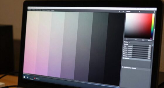
Customizing visuals in Matplotlib allows you to enhance the clarity and appeal of your plots by tailoring colors, styles, and annotations to suit your needs. You can apply color gradients to create smooth progressions, making your data more visually engaging. Adjusting font styles, such as size, weight, and typeface, helps emphasize important labels or titles. Using functions like `set_facecolor()` or `colormap`, you control the overall look, ensuring your plot aligns with your presentation style. Adding annotations with custom fonts makes your information clearer. These tweaks help your plot communicate insights more effectively, making complex data easier to interpret. Additionally, exploring color maps enables you to select appropriate color schemes that improve data differentiation and visual impact. With these customization options, your visualizations become not only more attractive but also more informative.
Drawing Basic Shapes: Lines and Circles

To create basic shapes like lines and circles in Python, you can use the plotting library’s functions to draw them directly on your canvas. For line art, the `plot()` function is perfect for drawing straight lines between two points. You specify the start and end coordinates, and Python draws the line for you. For circle drawing, the `circle()` method from the `matplotlib.patches` module allows you to add circles at specific locations with a defined radius. You can customize the appearance, such as color and line thickness, to enhance your shapes. These simple tools enable you to craft clear, precise basic shapes, forming the foundation for more complex geometric designs. Mastering lines and circles helps you build a solid foundation in geometric plotting, especially when working with high-pressure paint application techniques for consistent results.
Creating Polygons and Multi-sided Figures

Creating polygons and multi-sided figures in Python involves connecting multiple points to form closed shapes. You define each shape by specifying its polygon vertices, which are the coordinates of its corners. To create a polygon, you can use libraries like Matplotlib by passing a list of vertices to functions such as `Polygon`. Multi-sided figures are simply polygons with more than three sides, like pentagons or hexagons. Confirm your vertices are ordered either clockwise or counterclockwise to keep the shape properly closed. Once you define your vertices, plotting the shape becomes straightforward by adding the polygon to your plot. This approach allows you to craft a variety of geometric figures, enhancing your visualizations with multi-sided complexity. Understanding relationships can help in designing shapes that reflect real-world structures or patterns.
Using Loops to Generate Repetitive Patterns

Using loops is an efficient way to generate repetitive patterns in your geometric plots. By leveraging loop structures, you can automate pattern repetition, creating complex designs with minimal code. For example, a for loop can draw multiple shapes at different positions or angles, saving you time and effort. Loop efficiency allows you to produce intricate patterns by repeating simple commands, making your code cleaner and easier to modify. You can control the number of repetitions, spacing, and transformations within the loop, enabling dynamic and varied designs. This approach not only simplifies your code but also discover creative possibilities for generating compelling geometric visuals. Mastering loops enhances your ability to produce complex, repetitive patterns effortlessly in your plots. Additionally, understanding how to optimize your loops can significantly improve code performance and reduce runtime, especially when working with large datasets or complex visuals.
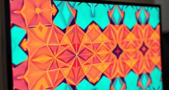
Applying Colors and Styles to Enhance Visuals

Applying colors and styles can considerably elevate the visual appeal of your geometric plots. Using color gradients helps create smooth progressions, making your patterns more engaging and easier to interpret. You can assign different colors based on data values or position, adding depth and clarity. Maintaining style consistency is essential; choose a color palette and stick with it across your entire plot to create a cohesive look. Additionally, customize line styles, markers, and fill patterns to distinguish different geometric elements clearly. Combining these techniques ensures your visuals are both attractive and informative. Remember, well-chosen colors and styles guide viewers’ focus and enhance the overall understanding of your geometric designs. For better results, understanding principles of color usage can significantly improve your plotting effectiveness.
Incorporating Coordinates and Transformations

Incorporating coordinates and transformations allows you to manipulate geometric plots dynamically, enhancing both their visual complexity and clarity. By applying coordinate transformations and affine mappings, you can translate, rotate, scale, or skew shapes easily. This flexibility helps you create more engaging and accurate visualizations. For example, shifting a shape’s position or changing its size becomes straightforward with simple code. Understanding relationships and the importance of clear communication can also improve how you present your plots, making complex data more accessible to viewers. Below is a table illustrating common transformations:
| Transformation | Effect |
|---|---|
| Translation | Moves shape without altering size |
| Rotation | Spins shape around a point |
| Scaling | Enlarges or shrinks shape |
| Shearing | Skews shape along an axis |
| Reflection | Flips shape over a line |
Mastering these techniques with coordinate transformations and affine mappings will make your plots more versatile and precise.
Building Complex Geometric Figures Step-by-Step

To build complex geometric figures, you’ll want to layer shapes effectively and use loops for repetitive tasks. Adding annotations and labels helps clarify each step of your design. These techniques make your figures clearer and more detailed as you progress. Incorporating organized design principles can also enhance the clarity and efficiency of your plotting process.
Layering Shapes Effectively
Layering shapes is a fundamental technique for building complex geometric figures in Python. By stacking shapes thoughtfully, you can create intricate designs with appealing symmetry and smooth color blending. Careful layering guarantees each shape enhances the overall composition, adding depth and visual interest. To illustrate, consider this table showing different shape combinations:
| Shape 1 | Shape 2 | Effect |
|---|---|---|
| Circle | Square | Symmetry & balance |
| Triangle | Circle | Dynamic layering |
| Rectangle | Ellipse | Blended colors |
| Hexagon | Triangle | Pattern consistency |
| Pentagon | Star | Visual complexity |
Experiment with stacking order and transparency to achieve harmony, making your geometric figures more compelling and visually rich. Additionally, understanding geometric transformations can help you manipulate shapes more effectively during layering.
Using Loops for Repetition
Using loops for repetition allows you to build complex geometric figures efficiently and systematically. By using a loop, you can create multiple shapes or lines that follow a pattern, saving time and effort. For example, you can draw a series of triangles or squares, changing properties like color or position in each iteration. Incorporating a random color adds variety, making your figure more dynamic. To do this, you work within a coordinate system, specifying positions for each shape or point. Loops help you iterate through these coordinates, drawing each element step-by-step. This approach simplifies creating intricate designs, allowing you to focus on the pattern rather than manually coding each shape. Repetition through loops is essential for constructing detailed, layered geometric figures efficiently.
Adding Annotations and Labels
Adding annotations and labels helps you clarify complex geometric figures by highlighting key points, lines, and angles. When annotating data, you draw attention to specific parts of your plot, making it easier to understand. To do this effectively, consider label placement carefully—position labels where they won’t overlap or obscure important details. Use functions like `plt.annotate()` to add text at critical points, specifying coordinates to guarantee clarity. You can also customize arrow styles and font size for better visibility. Proper annotation guides your audience through your geometric construction, emphasizing important features without cluttering the plot. By thoughtfully annotating data, you make your diagrams more informative and accessible, enhancing the overall clarity of your geometric figures.
Saving and Exporting Your Geometric Artworks

Have you ever finished a stunning geometric artwork in Python and wondered how to preserve it? Saving your work is essential for sharing or future edits, especially if you’re creating digital art. To export your artwork, you can save it as an image file like PNG or JPEG for quick viewing. If you need scalable, high-quality graphics, consider exporting as vector graphics using formats like SVG or PDF. Using libraries such as Matplotlib, you can easily save figures with the `savefig()` function. This function allows you to specify the format and resolution, ensuring your artwork looks sharp. Exporting in vector formats keeps your designs crisp at any size, perfect for printing or professional presentations. Understanding the importance of file formats can help you choose the best option for your needs. Saving and exporting your geometric creations guarantees your effort is preserved and ready for display or further editing.
Tips and Resources for Further Geometric Visualization

Once you’ve saved your geometric artwork, exploring additional tools and resources can help you push your visualizations further. Start by browsing matplotlib tutorials, which offer in-depth guidance on customizing plots, adding annotations, and enhancing visual appeal. These tutorials can help you master advanced techniques and troubleshoot common issues. Additionally, explore geometric visualization resources such as online galleries, forums, and open-source libraries to discover new styles and ideas. Engaging with communities like Stack Overflow or Reddit’s r/learnpython can provide practical advice and inspiration. Remember, continuous learning and experimentation are key to improving your skills. By leveraging these resources, you’ll deepen your understanding of geometric plotting and create more compelling, professional visualizations in Python. Also, understanding the fundamentals of asset division can help you approach complex problems with a clearer strategy and informed decision-making.
Frequently Asked Questions
How Can I Animate Geometric Plots in Python?
You can create dynamic animations of geometric plots by using libraries like Matplotlib’s FuncAnimation. Focus on applying geometric transformations such as rotations, translations, or scaling within your animation functions. You’ll update your plot data in each frame to visualize these transformations smoothly. This approach allows you to produce engaging, animated visualizations that clearly demonstrate geometric concepts in action, making your plots more interactive and insightful.
What Are the Best Practices for Optimizing Plot Performance?
They say “a stitch in time saves nine,” and this applies to optimizing your plots. To boost performance, focus on code optimization by minimizing unnecessary calculations and using efficient data structures. Use rendering techniques like blitting and vectorization to accelerate drawing. Keep your plots simple, reduce overplotting, and precompute static elements. These practices help your visualizations run smoothly, making your geometric plots both beautiful and responsive.
How Do I Add Interactive Features to My Geometric Diagrams?
You can make your geometric diagrams more engaging by adding interactive features like sliders and hover annotations. Use libraries such as Plotly or Bokeh, which support interactive sliders to adjust parameters dynamically, and enable hover annotations to display details about specific points or shapes. These tools make your diagrams more intuitive and user-friendly, allowing viewers to explore the data actively and gain deeper insights effortlessly.
Can I Use Python to Analyze Geometric Properties Mathematically?
Think of Python as a math detective’s magnifying glass, revealing the secrets hidden in geometric shapes. Yes, you can use Python to analyze geometric properties mathematically, aiding in geometric proofs and property calculations. It’s like having a toolkit that helps you measure angles, find areas, and verify relationships with precision. With Python, you turn abstract shapes into tangible data, making complex geometric analysis more accessible and accurate.
What Libraries Complement Matplotlib for Advanced Geometric Visualization?
You can enhance your visualizations by using libraries like Plotly and Mayavi alongside matplotlib. These tools support advanced features such as vector transformations and color mapping, making your geometric visualizations more dynamic and informative. Plotly offers interactive plots, while Mayavi excels in 3D visualizations. Together, they give you the power to explore complex geometric data with better clarity and depth.
Conclusion
Now that you’ve mastered Python’s geometric plotting, you’re basically an artist armed with code—your digital paintbrush. With a few lines, you can create intricate shapes or chaotic patterns that make modern art look like child’s play. So go ahead, wander through this pixelated gallery, and remember: in your hands, even a simple line can become a masterpiece—or at least a very fancy doodle. Happy plotting!