
When you break down flat designs, you’ll see they hide layers of visual cues and interactive details. Simple looks often mask subtle gradients, layered hues, and carefully crafted states like hover or active modes. These elements guide your eye, improve usability, and create a sense of depth, even if it’s not immediately obvious. If you keep exploring, you’ll discover how these hidden intricacies make flat designs both minimal and remarkably complex.
Key Takeaways
- Flat designs incorporate layered gradients and subtle cues that add visual complexity behind their minimal appearance.
- Interactive elements like hover effects and multiple states increase design intricacy when broken into parts.
- Visual hierarchy relies on nuanced color and contrast choices, revealing complexity in individual components.
- Balancing aesthetics and functionality requires detailed arrangements of visual cues within each part.
- The harmonious system of visual and interactive cues makes flat design parts more complex than they appear.
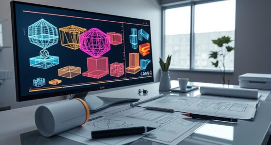
Flat designs are celebrated for their simplicity and clean aesthetic, but once these designs are broken down into individual parts, they often become surprisingly intricate. When you analyze these designs closely, you realize that their minimalistic appearance masks a web of subtle details. For instance, color gradients might seem unnecessary in flat design, but they’re often used to add depth and visual interest. These gradients aren’t always obvious at first glance—they’re carefully layered to guide your eye and create a sense of dimension. When you start dissecting the design components, you notice how these subtle shifts in hue and tone influence user engagement. They help direct your attention to specific elements, making your interaction more intuitive, even if the overall look appears straightforward.
Flat designs hide intricate details like layered gradients and subtle cues that enhance depth and guide user interaction.
As you explore deeper into the parts of flat design, you see that user interaction plays a vital role. While the design itself might appear simple, supporting features like hover effects, button animations, and responsive feedback add layers of complexity. These interactive elements are often built with multiple states—default, hover, active, disabled—that require precise visual and functional alignment. You might think a button is just a rectangle, but once it’s broken into parts, you realize it’s a combination of color, shading, and animation cues that work together to inform your actions. These small details increase the complexity because each component must work seamlessly with others to maintain the clean aesthetic while delivering a satisfying user experience.
Furthermore, the challenge lies in balancing minimalism with functionality. When you dissect flat designs into parts, you see that designers carefully select each element to avoid clutter while still providing necessary feedback. The use of color gradients, for example, isn’t just decorative; it helps differentiate sections and suggest hierarchy. They subtly indicate how you should navigate the interface without overwhelming you. This layered approach means that behind the simple appearance, there’s a thoughtful architecture of visual cues and interactions. Each part must be optimized to serve both aesthetic and functional purposes, which adds to the overall complexity.
In addition, understanding the visual hierarchy within flat designs reveals how subtle design choices influence user flow and comprehension. This hierarchy is often achieved through careful manipulation of color and contrast, which guides users naturally through the interface. In essence, what seems simple on the surface actually involves a sophisticated interplay of design elements. When you break down flat designs into their parts, you uncover a carefully crafted system where color gradients and user interaction cues work in harmony. This complexity guarantees that while the design remains visually minimal, it’s highly effective and engaging in practice.

gernie Self Locking Button Switch Control Mount Red Flat Head Pushbut Component for Lay37 11Bnzs, Pushbutton Switches, gernieauofp6mz89
Flat Head Design: The button switch adopts a flat head design, which can reduce the occurrence of accidental…
As an affiliate, we earn on qualifying purchases.
As an affiliate, we earn on qualifying purchases.
Frequently Asked Questions
How Do Flat Designs Impact User Experience When Broken Into Parts?
When flat designs are broken into parts, your user experience can suffer if visual hierarchy and color contrast aren’t managed well. Without clear visual cues, users might struggle to identify important elements or navigate smoothly. Proper use of contrasting colors and organized layout helps maintain clarity, guiding users effortlessly. If these aspects aren’t considered, the design becomes confusing, reducing usability and frustrating your audience.
What Tools Are Best for Managing Complex Flat Design Components?
Your tools are essential when managing complex flat design components. Use design systems like Figma or Sketch to organize your component hierarchy efficiently. These tools streamline collaboration, version control, and consistency across parts. Figma’s real-time updates and Sketch’s robust plugin ecosystem make handling intricate flat designs more manageable, preventing chaos and ensuring your project remains visually cohesive and user-friendly. They’re your secret weapon against design complexity!
Can Flat Design Principles Be Applied to Interactive Elements?
Yes, you can apply flat design principles to interactive elements by using minimalist icons that keep interfaces clean and simple. Incorporate gesture interactions like swipes or taps to enhance user engagement without cluttering the design. This approach maintains the flat aesthetic, making the interface intuitive and visually appealing while ensuring functionality remains straightforward and easy to navigate. Keep interactions seamless and visually consistent with your minimalist style.
How Does Scalability Affect Flat Design Components Over Time?
Scalability greatly impacts flat design components over time, influencing their design evolution. As your interface grows, maintaining component modularity becomes essential to guarantee adaptability across various devices and screen sizes. When flat design elements are scalable, they remain clean and simple, but poor scalability can cause components to become complex and cluttered. Prioritizing modularity allows you to update parts easily, keeping the overall design consistent and user-friendly as it evolves.
What Are Common Challenges in Maintaining Flat Design Consistency?
Maintaining flat design consistency is like chasing a moving target amidst a shifting landscape. As design evolves, visual hierarchy can become muddled, making it hard to keep elements cohesive. Common challenges include balancing simplicity with functionality, ensuring uniform style across components, and adapting to new trends without disrupting harmony. You need to stay vigilant, constantly refining your approach to preserve clarity and unity in your flat design, despite evolving parts.

Artist Unknown 4 Color Voice Recording Button, Dog Buttons for Communication Pet Training Buzzer, 30 Second Record & Playback, Funny Gift for Study Office Home – 4 Color Packs
【30 Second Clear Recording】The Record button allows you to record up to 30 seconds of clear sound. You…
As an affiliate, we earn on qualifying purchases.
As an affiliate, we earn on qualifying purchases.
Conclusion
As you see, flat designs are like a clear, open sky—simple and elegant at first glance. But once they turn into parts, they can become a tangled web, much like a dense forest. To keep your designs straightforward and effective, remember that simplicity is your guiding star. Don’t let complexity hide your true vision; instead, prune and refine, so your creation remains a beautiful, accessible landscape for everyone to enjoy.

Govee RGBIC LED Strip Lights, Smart LED Lights for Bedroom, Bluetooth LED Lights APP Control, DIY Multiple Colors on One Line, Color Changing LED Strip Lighting Music Sync, Home Decor, 16.4ft
Smart RGBIC Effects: RGBIC LED Strip lights for bedroom display multiple colors on one line at a time…
As an affiliate, we earn on qualifying purchases.
As an affiliate, we earn on qualifying purchases.
responsive visual cue indicators
As an affiliate, we earn on qualifying purchases.
As an affiliate, we earn on qualifying purchases.