
Poster designers use grids to organize elements systematically, guiding your eye smoothly across the layout. They strategically place headlines with high contrast and large fonts in key grid areas to create focus, while supporting details stay in less prominent sections. By establishing clear visual hierarchy and using color contrast, they control where your attention goes first. If you explore further, you’ll discover how these techniques work together to make your posters more eye-catching and effective.
Key Takeaways
- Grids guide element placement to create balanced, organized layouts that naturally direct viewers’ focus.
- Designers use grids to establish a clear typography hierarchy, emphasizing key messages with size and weight.
- Contrasting colors within grid sections highlight focal points and create visual pathways for viewer attention.
- Grids help layer information, positioning essential details prominently while supporting secondary content.
- Applying grid-based composition ensures cohesive, visually engaging designs that control attention effectively.
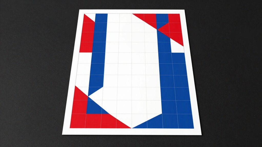
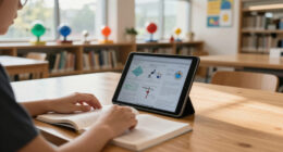
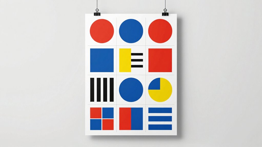
When designing a poster, using grids is one of the most effective ways to guide viewers’ attention and create a balanced layout. Grids help you organize information logically, ensuring that each element has a clear place and purpose. They act as invisible guides, allowing you to align text, images, and other visuals systematically. This structure makes the poster easier to read and more visually appealing. As you work within a grid, think about how to establish a clear typography hierarchy. This means deciding which information is most important and should stand out. Larger, bolder fonts naturally draw the eye first, while smaller, lighter text provides supporting details. Proper typography hierarchy prevents clutter and guides viewers smoothly through your message. You decide where to emphasize key points through font size, weight, and style, all while keeping everything aligned within your grid. Incorporating visual hierarchy helps reinforce the importance of different elements and enhances overall clarity. Color contrast is another powerful tool you can leverage within your grid-based layout. By choosing contrasting colors for text, backgrounds, and visuals, you create visual focal points that immediately grab attention. For example, a bright headline on a dark background makes your message pop, ensuring viewers don’t miss the main idea. When working with a grid, you can strategically place high-contrast elements where you want to direct attention. This prevents the poster from becoming overwhelming or chaotic, helping viewers focus on the most important parts first. Consistency in color contrast across your grid also maintains harmony, so the eye naturally moves from one section to the next without confusion. Using grids gives you control over how viewers navigate your poster. You can emphasize key messages through a combination of typography hierarchy and color contrast, making sure the most critical information stands out. Think about how your text is arranged within the grid—larger, bold fonts on high-contrast backgrounds immediately tell viewers what to focus on. Smaller details or secondary information can be placed in less prominent sections of the grid, guiding attention gradually. This layered approach creates a clear path for the eye, reducing clutter and increasing comprehension. Incorporating design principles can further enhance how you use grids to manage attention and create engaging visuals. Additionally, being aware of passive voice can help you craft clearer and more direct messages within your design. Recognizing and applying composition techniques ensures your layout remains balanced and visually appealing, further supporting your attention control strategy.

Clear Sewing Ruler, 2 Pcs 2 × 12 Inch Plastic Grid Transparent Ruler with Sandwich Scale Straight Measuring Tool for Pattern Grading Making Quilting DIY Crafts Clothes Design
【What You Get】The package includes two sewing rulers, each measuring 2 x 12 inches, a generous quantity to…
As an affiliate, we earn on qualifying purchases.
As an affiliate, we earn on qualifying purchases.
Frequently Asked Questions
How Do Grids Influence Emotional Responses in Poster Design?
You can use grids to influence emotional responses by strategically placing elements that evoke emotional cues, guiding the viewer’s feelings. Well-organized grids create visual harmony, fostering a sense of comfort or excitement, depending on your design choices. This structure boosts viewer engagement by making the poster easier to process and emotionally impactful, encouraging viewers to connect with your message. Ultimately, grids help you control how viewers emotionally respond to your poster.
Are There Specific Grid Types Best for Certain Poster Themes?
Yes, specific grid types suit certain poster themes. For a bold, modern poster, you might choose a modular grid to emphasize structure and clarity. If your theme is more dynamic or chaotic, a freeform or asymmetrical grid can create energy and movement. Your grid selection directly impacts how viewers process the message, so aligning your grid type with your poster theme guarantees the design effectively communicates and grabs attention.
How Do Grids Impact Readability on Different Screen Sizes?
Grids keep your design from falling apart when viewed on different screens, acting as the backbone for responsive layouts. They help guarantee your poster remains clear and engaging, regardless of device size. By considering accessibility, you make your content usable for everyone. With a well-structured grid, you avoid the pits of clutter and confusion, so your message hits home no matter the screen size. It’s a win-win for readability and reach.
Can Grids Improve the Visual Balance of Complex Posters?
Yes, grids can improve the visual balance of complex posters by establishing a clear visual hierarchy and ensuring composition consistency. You can organize multiple elements systematically, making the poster easier to navigate and more aesthetically pleasing. Grids help you align text, images, and graphics precisely, which reduces clutter and enhances overall harmony. This structured approach guides viewers smoothly through your message, making even intricate designs feel cohesive and balanced.
What Common Mistakes Should Designers Avoid When Using Grids?
You should avoid poor alignment consistency and imprecise margins when using grids. Inconsistent alignment can make your poster look chaotic, distracting viewers from the message. Similarly, neglecting margin precision can disrupt visual harmony and cause clutter. Always double-check your grid layout to guarantee elements are aligned properly and margins are uniform. This attention to detail helps create a professional, balanced design that guides viewers seamlessly through your poster.
Maslow's Hierarchy Of Needs Classroom Poster – Self Actualization Poster – Self Growth – Mental Health – 12 x 18 Inch – Classroom Decor – Classroom Must Haves – Back To School Decor – CPS0161
Inspire Learning: This 12 x 18 inch classroom poster is designed to motivate and encourage elementary students with…
As an affiliate, we earn on qualifying purchases.
As an affiliate, we earn on qualifying purchases.
Conclusion
Now, picture your poster coming to life, each element perfectly aligned within the grid, guiding viewers’ eyes effortlessly. The tension builds as you realize how strategic grid use can make or break attention. Will your design lead viewers straight to the message or leave them wandering? When you harness this unseen framework, you hold the power to command focus and evoke emotion—just waiting to be revealed in your next masterpiece. Are you ready to create with purpose?

Elements of Art: Color And Value 5 x 16 Posters (Set of 25)
Elements of Art: Color and Value Posters
As an affiliate, we earn on qualifying purchases.
As an affiliate, we earn on qualifying purchases.

2 x Grid Type Lettersize 'Freehand Designer' Sheets. Draw Perfect Straight Lines Templates. Grid Type Sheets for Scale Drawings
Enables drawing of horizontal and vertical straight lines freehand
As an affiliate, we earn on qualifying purchases.
As an affiliate, we earn on qualifying purchases.